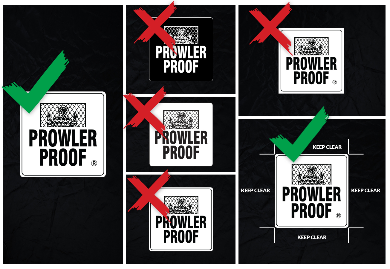
Prowler Proof has been investing in growing brand awareness since its inception and, has been increasing efforts in recent years. When it comes to building a memorable brand, consistency is everything. This creates clarity around the brand and less confusion from the consumer. It’s essential for the brand to be represented in the same way, from the start of the consumer’s journey to the end. We need everyone's input within this consumer journey, to deliver consistency.
Here are five common mistakes that we see with the use of the Prowler Proof primary logo:
- Prowler Proof is a white badge with black writing and comes as one piece, it should not be reversed.
- The Prowler Proof logo has an extra white border beyond the black border, this should not be cut off.
- The registered trademark should never be removed.
- The Prowler Proof logo has rounded corners on the outside border, they should not be squared off.
- Not enough white space around the edge of the logo. Use the height of the P as a minimum of space around the logo.

Below is a link to our most current assets on the certified page, as well as a logo guide for use when sending artwork to printers and, if you’re using the Prowler Proof logo in your design, we ask that you send these guidelines to the printer with the logo.
https://www.prowlerproof.com.au/certified
We also ask that when signing off proofs from external suppliers, these common mistakes are checked. If you aren’t confident signing off on these, please don’t hesitate to send these through to the marketing team at marketing@prowlerproof.com.au.
